
Efficiency and clarity are the bread and butter of UX writing, but often our own internal processes are the messiest part of the job.
I’d like to share a UX copy review process that I’ve adapted from Dr Katharina Grimm, a UX writer who shared a brilliant video about performing UX copy audits.
My system is slightly tweaked to the needs of my team and workflow, so while it isn’t an exact copy, I want to give her full credit for simplifying the UX review process for me.
The problem: Breaking the “switching” cycle
Previously, my team used Confluence (for text-heavy UIs) or Jira tickets as our one source of truth.
However, I felt that this caused significant cognitive friction for both the designers and the UX writer.
Having to switch from one platform to another—both using very different UI systems—inevitably slows down the work. On top of that, UX writers had to:
- Reproduce the original copy from Figma.
- Include a link to the relevant screenshot.
- Provide an image of said screenshot so designers knew exactly which element was being discussed.
Not only does this friction result in mistakes during the transfer of content, but it is also a lot of time wasted on manual work.
Why a dedicated figma board?
The new system I created eliminated the need for designers to switch between platforms.
They can simply copy the relevant elements from my board directly into their own Figma files. They are able to easily identify which copy needs to be changed and on which part of the screen.
I decided to create my own separate Figma board for copy reviews, rather than implementing this system directly on the designer’s working board, to prevent confusion.
In the past, I tried giving feedback on the live design board, but it led to lost comments and shuffled copy.
For a UX writer, it is vital to have a single source of truth for the copy review so that we can look back and see what was changed.
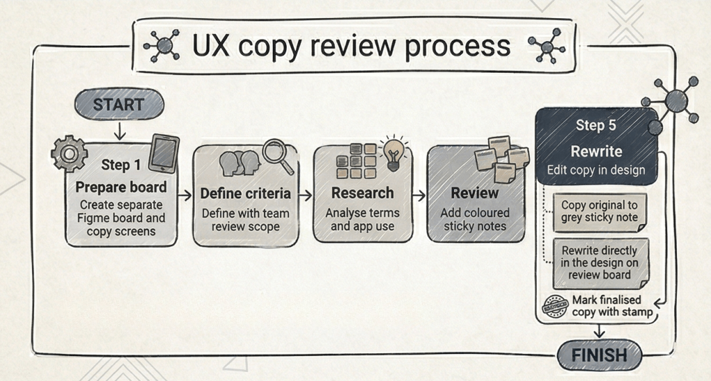
The UX Copy Audit Process
I kick off the UX copy review process by defining the review criteria with product managers and designers. Then, I scope the work by clarifying exactly which screens need a review.
1. Defining the criteria
What do I look for when correcting UX copy? I categorise my review into four main buckets:
| Criterion | Description |
|---|---|
| Correctness | Basic grammar, punctuation, and spelling. |
| House Style | Ensuring the copy is consistent with our established brand voice and style guide. |
| Usability | The copy might be grammatically correct, but does it help the user navigate the product effectively? |
| Quality | Improving the sentence so that it is more readable, clear, and succinct. |
2. Research and analysis
Next, I conduct research of the app to get a “bird’s eye view” of the project. What is the intent of the app? What do users want to achieve with it?
I then look into technical terms to gain a better understanding and to ensure the copy conveys the right context.
For example, if I’m reviewing survey tools, I’ll research terms like CSAT or NPS to decide on the correct casing and usage. At this stage, I am doing more analysis than actual writing.
3. The copy review
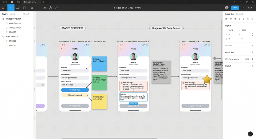
Once the research is done, I perform the review by placing coloured sticky notes next to the UI elements to highlight changes based on the criteria mentioned above.
4. The rewrite
Finally, I rewrite the copy.
- I copy the original text into a grey sticky note as a reference (our source of truth).
- I rewrite the copy directly in the design.
- I mark it with a stamp to indicate completion.
This makes it easier for designers to see exactly what has been updated and replace their text boxes without any “mind-boggling” transitions between systems.
Final thoughts
I really enjoy crafting processes that account for every team member’s challenges. My main goal was to reduce friction; in Figma, a designer can simply copy a text box and replace it in their design, reducing the margin for error.
Question: What does your copy review process look like?
I am always looking for suggestions to improve this workflow. If you have any ideas that make it easier to implement changes without mistakes, please let me know in the comments!

Leave a Reply